Wednesday 3rd November 2004
Finance : Fourth lecture (part one).
Review session to ascertain the material learned so far.
Introduction
The plain plot of a series of data
A more important plot : the histogram
The histogram approximates the exact distribution of probability
The mean
The variability
Gaussian distributions
Profitabilities
Random walk of prices of a security
Examples of random walks
What matters is the profitability (and the risk) of a security, not its price
Risk of a security
When do two securities have the same "risk
pattern" ?
Today's lecture is devoted to reviewing the main concepts we have met so far, practice with them and try to see their deep simplicity and power. In particular we will review the probability concepts that we have encountered, and illustrate them as much as we can with the help of the random number generator of Excel.
Just like it is not possible to understand Accounting without knowing Counting, it is not possible to understand Finance without knowing elementary Probability.
To explain Finance, some textbooks start with Discounted Cash Flow analysis, then talk about Risk, and finally, after several chapters and almost two hundred pages, begin to explain Probabilities. We believe that this presentation is a source of fuzziness and confusion, because the deep and simple reason for discounting cash flows can only be understood in the framework of Probabilities. Otherwise it is only a collection of cookbook recipes with a vague justification.
For example, in Brealey & Myers, we can read on page 153 (6th edition) "We have managed to go through six chapters without directly addressing the problem of risk, but now the jig is up."
And the fundamental fact of Finance, which is investors' risk aversion (i.e. : for two securities with the same expected value in one year, investors will pay more today for the security with the least variable value in one year), is only introduced on page 189 in small characters in the legend to a picture.
It is like a book on Accounting that would say on page 150 "We have managed so far to present transactions and account keeping without using arithmetics, but now it is time to explain addition". And the explanation that, when the sales of a period are larger than all the consumption expenditures of the same period, the balance sheet increases in a way that makes the owners happy, would be introduced as a footnote on page 200 !
We believe this way of introducing Finance leads only to an "impressionistic" understanding of the subject matter, and in the end makes the study by the students harder.
So, the order we follow is to present :
- data
- the plot of data
- the histogram
- distribution of probability
- variability
- risk
- opportunity cost of capital
- DCF
- etc.
The plain plot a series of data
Important data that we deal with in Finance are future values of securities. I have a security in my pocket today, or I'm offered to purchase a security today ; what will be its value in one year ?
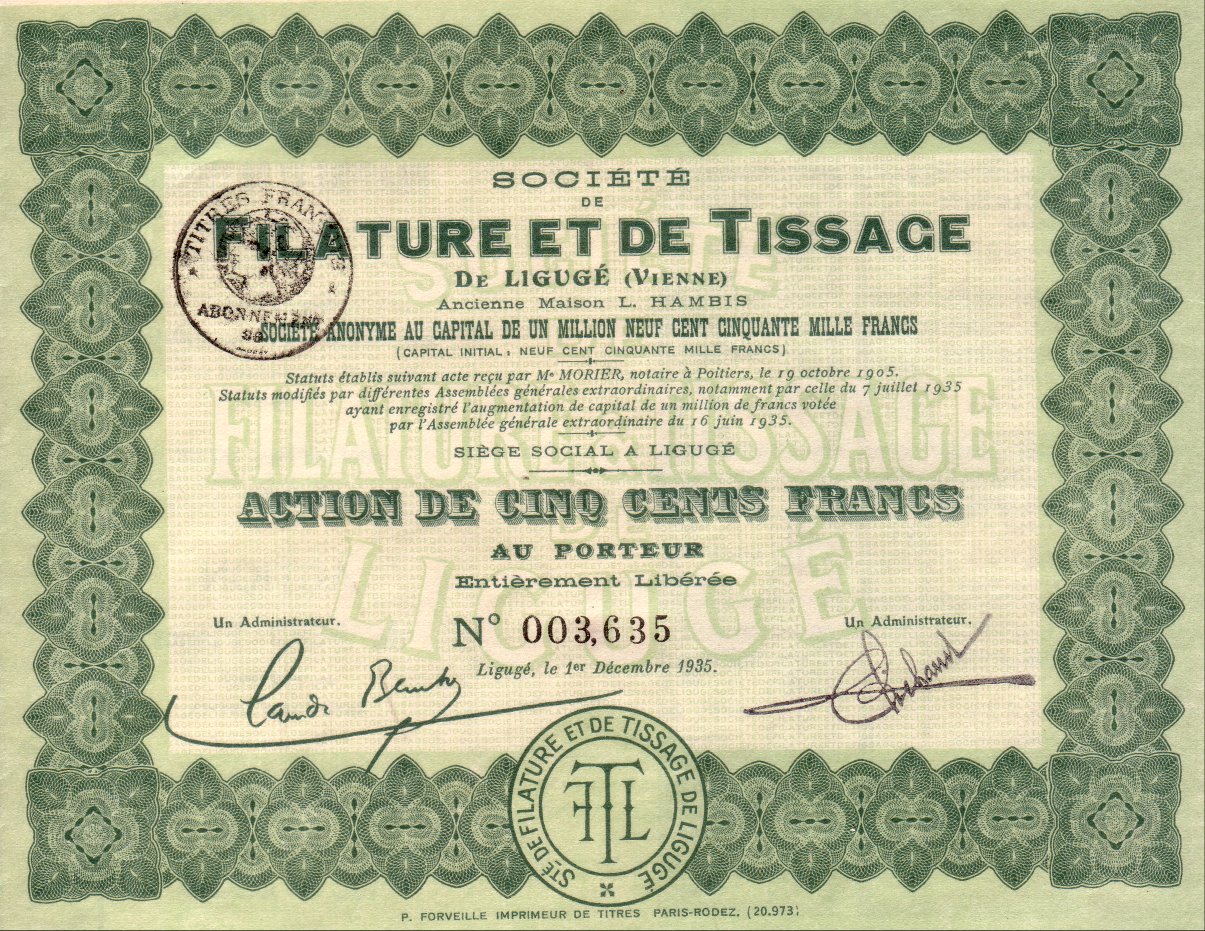
Here is a security, it is a share of the firm "Filature et Tissage du Ligugé" :
This piece of paper certifies that its holder (me) owns a part of the firm, and therefore is entitled to a part of the dividends, when some are paid, as well as to participating in the important decisions about the management of the "Filature et Tissage du Ligugé".
This simple setting also encompasses the situation of making a simple investment : I contemplate to invest today a sum P into a project, and I expect that this investment will produce a cash flow X in one year ; is it a good investment ?
So randomness is at the heart of the behavior of a security in the future. If we could reproduce the experiment "going from today to a year from today" we would get different figures for the value of our security then, or for our cash flow X in one year.
In order to study this comfortably, we use the random number generator of Excel.
Most random values we meet in Finance have a distribution of probability which is of a Gaussian type (also called Normal), so we use Excel to generate Gaussian distributed random numbers. We use the function "=RAND()", and then apply the function "inverse normal distribution" where we have to specify which mean and which standard deviation we want. These concepts will be amply illustrated below.
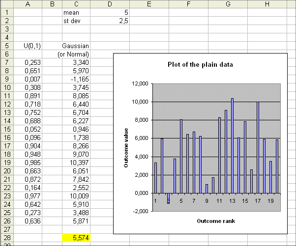
In column C we have 20 outcomes of random variable that is Gaussian with mean 5 and standard deviation 2.5
As we know from our everyday experience, the 20 actual outcomes have themselves a mean (here 5.574) that is not too far from 5, the mean of the random variable. If we produce another batch of 20 outcomes we will get another actual mean, not far from 5, but not equal to 5.574
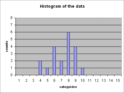
The plot represented above is "the plain plot of the data" (or the "plot of the plain data") : we just plot each data one after the other : 3.34, 5.97, -1.165, etc...
This plot of the plain data is nice and very natural. It is the one that comes to mind first when we think of plotting our data. But it is not the most useful plot we can draw from the data.
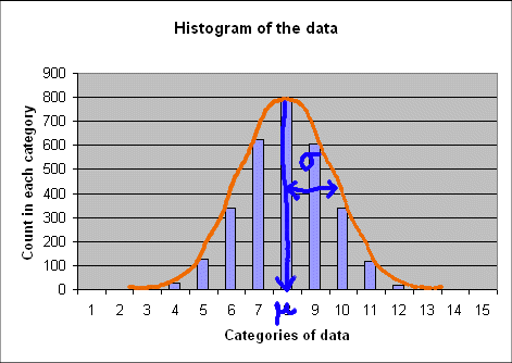
There is another plot that is more useful : it is the histogram. The histogram is another plot, different from the one above. We are all familiar with histograms, but we may not have realized how useful, powerful, and subtle too, they are.
A more important plot : the histogram
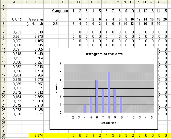
The idea behind the histogram is to count how many outcomes fall in each horizontal "slice" of possible values.
For instance, in the slice "from -2 to 0", one outcome fell : the third one.
In the slice "from 0 to 2", two outcomes fell : the ninth and the tenth. Etc.
The idea of "slicing" a plot along horizontal lines, and see what happens in each slice, is an important idea in mathematics, that was still leading to important new discoveries at the beginning of the XXth century. Here we make a very simple use of it.
The horizontal slices piled up along the vertical axis, we shall call "the categories" of possible values of the outcome. To sweep widely the vertical axis, we shall define 15 categories :
category one : values < -6
category two : -6 ≤ values < -4
category three : -4 ≤ values < -2
category four : -2 ≤ values < 0
category five : 0 ≤ values < 2
etc.
category fourteen : 18 ≤ values < 20
category fifteen : values greater than or equal to 20
(We have to select "reasonable" slices. Changing the size of our slices will change somewhat the look of the resulting histogram. See : http://www.stat.duke.edu/sites/java.html section "histograms")
We count the outcomes in each category. And we plot our results as follows :
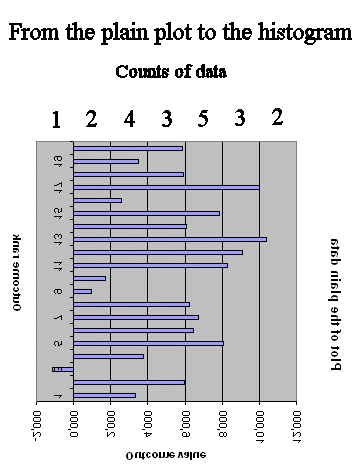
So the histogram can be viewed as "reversing the axes" in the plain data plot, and counting the data in each category of value :
The usefulness of the new graph, the histogram, is that is gives us information about the frequency distribution of the data, which the plain data plot does not readily give us.
The histogram approximates the exact distribution of probability
From the 20 outcomes of our random variable we drew a histogram.
With another batch of 20 outcomes of the same random variable we shall get a new histogram, that will have the same general shape as the first one.
With another batch we get yet another histogram. Etc.
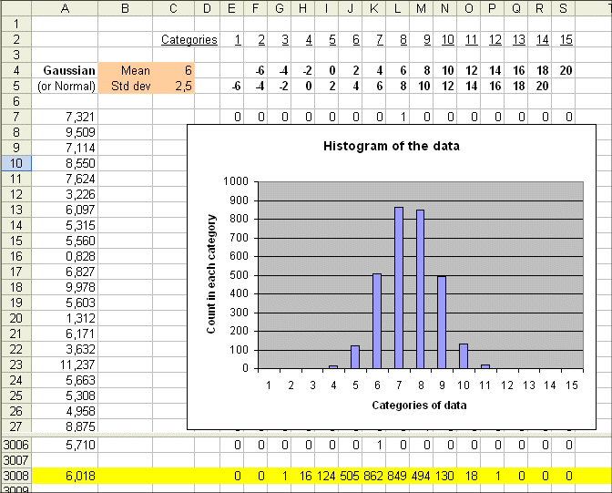
Here is a series of 5 such histograms obtained from producing, each time, 20 outcomes of the random variable Gaussian(mean = 6 ; std dev = 2.5) :
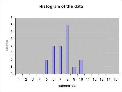
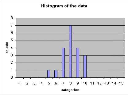
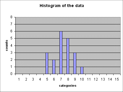
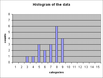
The important point to note is that all of these five histograms show roughly the same mean between the 7th and the 8th category (and this is expected because the 7th category is "4 to 6", and the 8th is "6 to 8", and the exact mean of the random variable is 6).
And all these histograms show roughly the same spread (i.e. the same width). We shall review in a moment how we define and measure this spread.
We know that if instead of 20 outcomes of the random variable, we produce 3000 outcomes, then the histogram we shall get will be very regular and will suggest rather precisely the density of probability of the random variable :
Remember : Bell shaped curves are the most common distributions of probability of random variables. We saw them appearing with just throwing 5 dice at the same time and summing up the results. These curves are everywhere, where phenomena are the result of many small additive effects.
From the above histograms we can "see" approximately the mean of the random variable : it is roughly (or more precisely if we have 3000 outcomes) the middle of the graph of sticks.
Here it falls between the 7th and the 8th category, because the 7th category is "4 to 6", and the 8th is "6 to 8", and the exact mean of the random variable is 6.
Now is time, as I mentioned above, to look more closely at another feature of these histograms : the spread they display.
The spread of the histograms plotted above give an idea of the variability of the outcomes of the random variable around the mean.
If we produce a series of outcomes with less variability the ensuing histogram will be narrower.
Here is a sequence of outcomes of a random variable, with the same mean but less variable than Gaussian (6 ; 2.5), and their histogram :
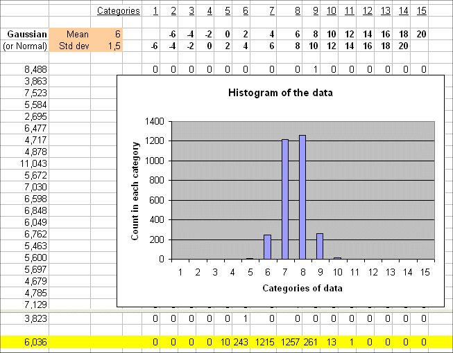
We get a narrower histogram than before, because the data are more concentrated in the categories around 6.
If we produce a series of 3000 outcomes of a random variable, that has mean 6.3 and variability 0, then we get a very simple histogram :
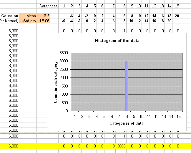
We can no longer call this a "random variable", can we ?
So the variability, or spread, of a random variable is an important feature we must be able to measure and sometimes control.
Let's turn to its definition :
Let Y be a random variable.
Let's call μ the mean of Y (pronounced "mu", like in 谬, an unhappy coincidence because the "error" will be denoted σ), and also denoted E(Y).
The deviation of outcome yi around μ is defined as
yi - μ
Here are 100 outcomes of a random variable Y with exact mean 5 and a certain spread. The table also gives the 100 deviations :
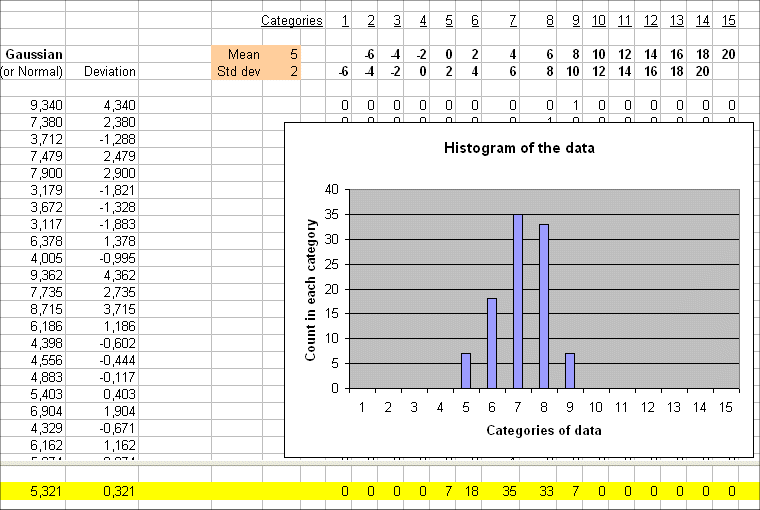
We see the 100 deviations : 4.30, 2.38, -1.288, etc.
The simple average of these 100 deviations is 0.321, that is close to zero. This is as it should be, because the exact mean of the deviation of Y is zero.
From the deviations, we go to the squared deviations :
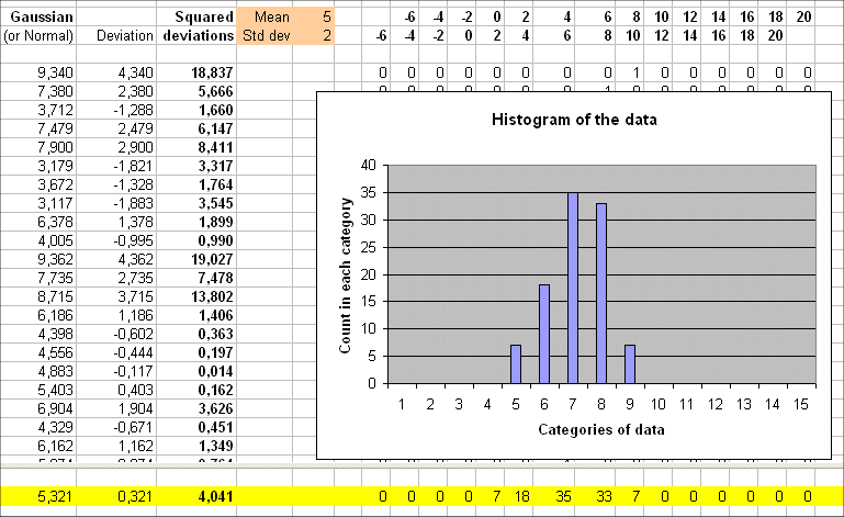
The 100 outcomes have a simple averaged squared deviation of 4.041
In fact this is an approximation of the expected squared deviation of the random variable Y. This concept is called the variance of Y and is defined as this
Variance(Y) = Exp{ [ Y - E(Y) ]2 }
And the square root of the variance of Y is called "the standard deviation of Y".
It is denoted sd(Y), or σ(Y), or σY (which ever we like as long as we are clear. Remember : mathematical notations are just meant to be as clear as plain explicit english, while being more concise.)
σ(Y) = square root of Exp{ [ Y - E(Y) ]2 }
In the above simulation I used Excel to generate 100 outcomes of a random variable Y with Gaussian distribution, with mean 5 and standard deviation 2.
So it is no surprise that the average of the 100 outcomes is 5.321 and the average squared deviations is 4.041 (because this last figure approximates the variance of Y).
The estimated standard deviation from the 100 outcomes y1, y2, .... y100 is square root of 4.041 = 2.010
Gaussian distributions are a collection of bell shaped densities of probability, specified by their mean and standard deviation.
There is only one Gaussian distribution with mean 7.35 and standard deviation 2.38
The general shape is this :
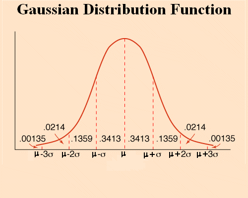
The mean μ is the absissa of the middle of the bell.
And the standard deviation σ is the distance between the mean and the absissa where the tangent to the bell stops decreasing to increase again.
The probability that an outcome falls between μ - σ and μ + σ is 68%
And the probability that an outcome falls between μ - 2σ and μ + 2σ is 95%
Let's use Excel to generate 3000 outcomes of a Gaussian ( mean = 7 ; sd = 3 ) and plot the histogram : we get this :
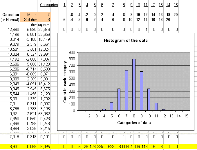
We get a histogram that follows exactly (with discrete sticks) the shape of a the Gaussian (7;3)
The mean is in the 8th category, that is between 6 and 8 (and indeed it is 7). And the standard deviation can also be read from the graph :
We see that σ is about 3.
So far we generated outcomes of a random variable without paying much attention to what we actually wanted to simulate. We said that they were possible prices next year of a security.
Mind you, they were not a sequence of possible yearly prices of a security, from year 1 to year n.
Indeed the prices from one year to the next of a security are not independent outcomes of one random variable. That's because if the price one year reaches xi, then the following year the price xi+1 will depend upon xi.
xi+1 will vary "in the vicinity of xi". If xi was high, xi+1 will be a random value with a higher mean than if xi was small.
In Finance the standard model for the sequence of prices of a security, from year 1 to year n, is that the yearly profitabilities are independent outcomes of one random variable.
Let's consider a security S the price of which at year 0 is P. At year 1, the security will have a value X1. Therefore the profitability of S, viewed from year 0, is the random variable
R1 = ( X1 - P ) / P
R1 takes a value, say r1. And therefore X1 takes a value x1 = P*(1 + r1).
Then we crank up one year all the reasoning :
The price of S at year 2 will be a value x2 that is obtained as
x2 = x1*(1 + r2)
It is the sequence r1, r2, .... rn, the yearly profitabilities, that are independent outcomes of one random variable R.
For a given security S, the yearly profitability R is a random variable with a mean denoted rS and a standard deviation denoted σS.
Here is a simulation of 100 profitabilities from a Gaussian (mean = 7% ; standard deviation = 20%) :
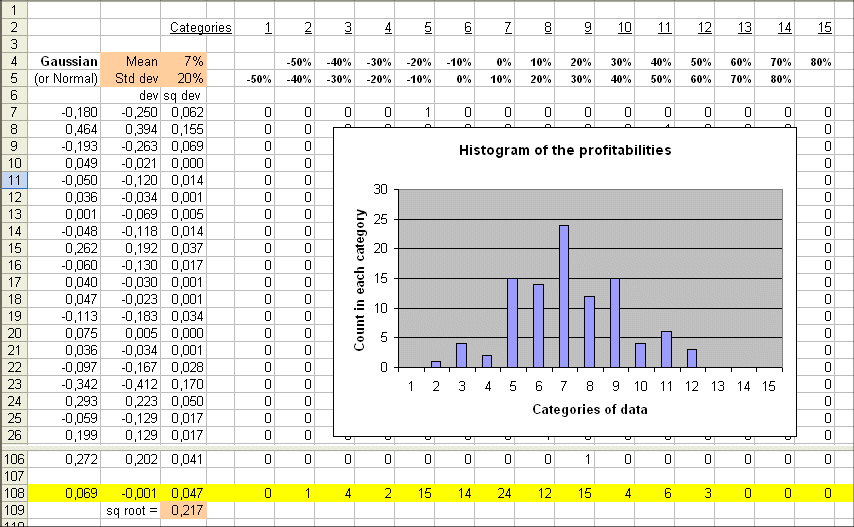
As usual we check that the estimated values for the mean and the sd (0.069 and 0.217) are in line with the theoretical values (7% and 20%).
Random walk of prices of a security
A security S whose initial price is P = 5€, and whose profitabilities are those of the preceding section, would have the following sequence of yearly prices :
x1 = 5*(1 - 18.0%) = 4.1€
x2 = x1*(1 + 46.4%) = 6.002€
x3 = x2*(1 - 19.3%) = 4.841€
etc.
The sequence of prices is called a random walk :
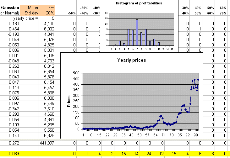
It is important to understand well this picture. It encompasses a good part of simple finance : yearly profitabilities, the ensuing sequence of prices, the spread of the profitabilities around their mean (of 7%), and therefore the jagged character of the random walk of prices.
Exercise : To understand well everything what we saw up to now, the best way is that you build by yourself an Excel document that reproduces the various simulations presented.
If the profitability from one year to the next does not have any variability, for instance E(R)=4% and σ(R)=0, then we get the following non-random evolution :
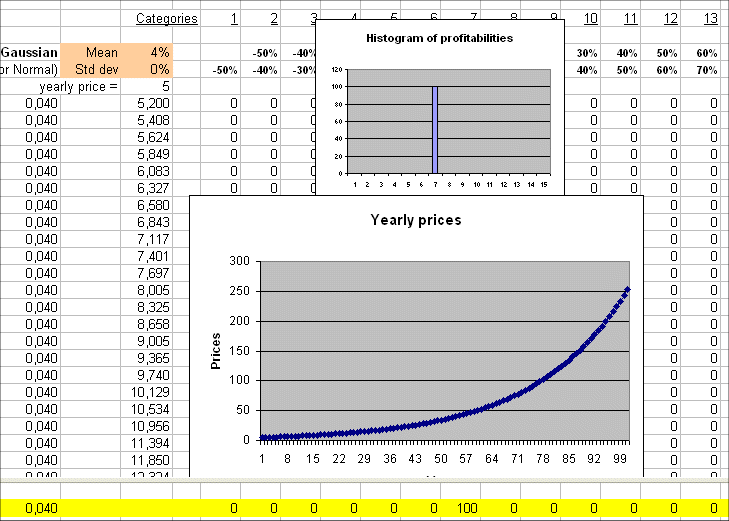
But we know that the only security, in euros, that yields a sure interest rate is a short term government bond from a country of the euro zone. And we know that the yield, as of November 2004, is 2% per year.
So the above graph of prices is impossible in real life.
People that promise us a sure return of 10% or more (usually they promise things like "25% for sure"...) per year are cheating us. Most usually they pay the interests to early subscribers by borrowing more money to new subscribers. And after a variable number of years, depending on how fast they can talk, their whole scheme collapses. (Note that this is what the government of my country does with the pension money of salaried workers. But this is another story...)
As we saw, the simplest model of behavior of the price of a security over a number of years, is a random walk.
It is important to grasp that the same probabilistic setting can, over one period, enrich greatly the investor, and another period of the same length make him broke.
Here are two random walks, over 20 years, with the same hypotheses (profitability R is a Gaussian with mean 14% and std. dev. = 20%) :
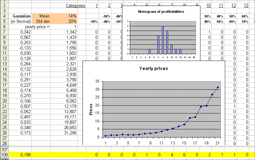
and
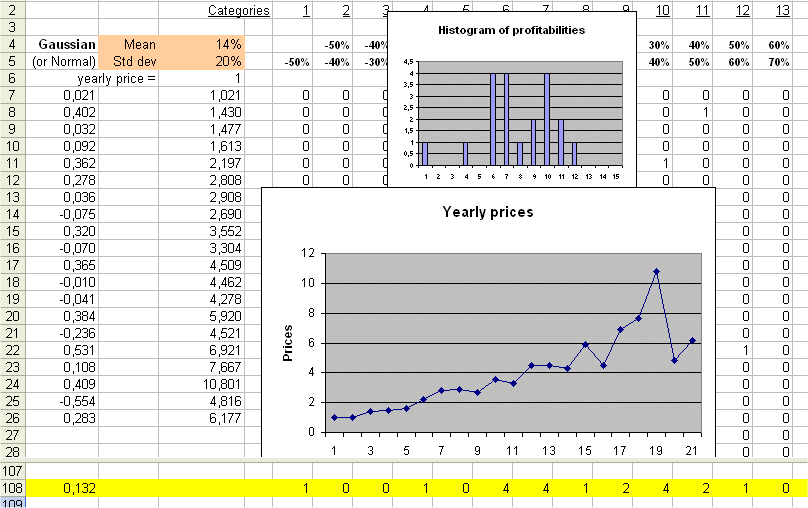
We see that in one sequence of 20 years we can transform $1 into $31, and in another sequence of 20 years from $1 at the beginning we may end up with only $6 twenty years later.
What matters is the profitability (and the risk) of a security, not its price
Let us leave for a while the sequence of prices of a security over a period of years, and concentrate on what value it will have in one year.
First of all, let us note that we are more interested in the profitability and the risk of a security than in its price.
If one security S is worth today 5€, and another one T is worth 20€, if we have 1000€ to invest we can either buy 200 S's or 50 T's. What matters to us is the profit we shall make in one year, that is the value reached then by our 200 S's or by our 50 T's.
Whether the profit made by our 1000€ is achieved by 200 small pieces or by 50 larger pieces is irrelevant. What matters is the ratio, and the risk of this ratio.
We talked a lot about the profitability of a security and about the risk of a security. We need to give firm clear definitions of both.
For the profitability there is no mystery.
Consider a security S, that trades today for a price P, and that will reach a value X in one year. X is a random variable.
The profitability of S is defined as
R = ( X - P ) / P
R has a mean : E(R) = ( E(X) - P ) / P = E(X)/P - 1
We usually denote rS = E(X)
R has a variance : Var(R) = Expected value of { [ R - E(R) ]2 }
Properties of variances :
Exercise : check this with the Excel simulateur.
So Var(R) = Var(X) / P2
Therefore std. dev. of R = std. dev. of X / P
We denote the standard deviation of R, σS.
Now we are in a position to define the risk of a security :
σS , the standard deviation of the profitability of a security S, is by definition the "risk of S".
So now we have a clean clear definition for the risk of a security. The definition sounds a bit heavy, but we shall get used to it.
When do two securities have the same "risk pattern" ?
Often we shall be lead to compare two securities S and T for which we know the expected future cash flows E(X) and E(Y), and the standard deviations of these future cash flows, sd(X) and sd(Y). But we don't know the current prices of both ; usually because one of them is not traded on the market, and precisely we want to figure out a price.
In that case, we shall say that S and T have the same "risk pattern" if and only if :
E(X) / sd(X) = E(Y) / sd(Y)
The intuitive meaning of this is that X and Y behave exactly in the same way, up to a possible scaling factor.
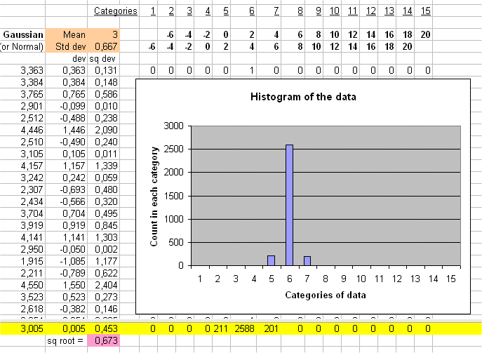
For instance E(X) = 6€ and sd(X) = 1.333...€ and E(Y) = 180€ and sd(Y) = 40€.
We see that Y behaves like 30 X's.
For example the two RV below have the same risk pattern :
and
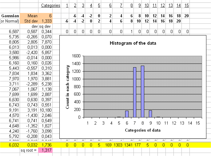
The second one behaves exactly as twice the first one.
So talking about the "risk pattern" of a security does not require to know its price.
(But, by definition, in Finance, the risk of a security is the std. dev. of its profitability, and therefore makes implicit mention of its price.)
Now we are in a position to explain in a very clear way what is a Discounted Cash Flow analysis.
Break time